
Colour is one of the most powerful tools in interior design, capable of shaping moods, defining spaces, and creating harmony within a home or workspace.
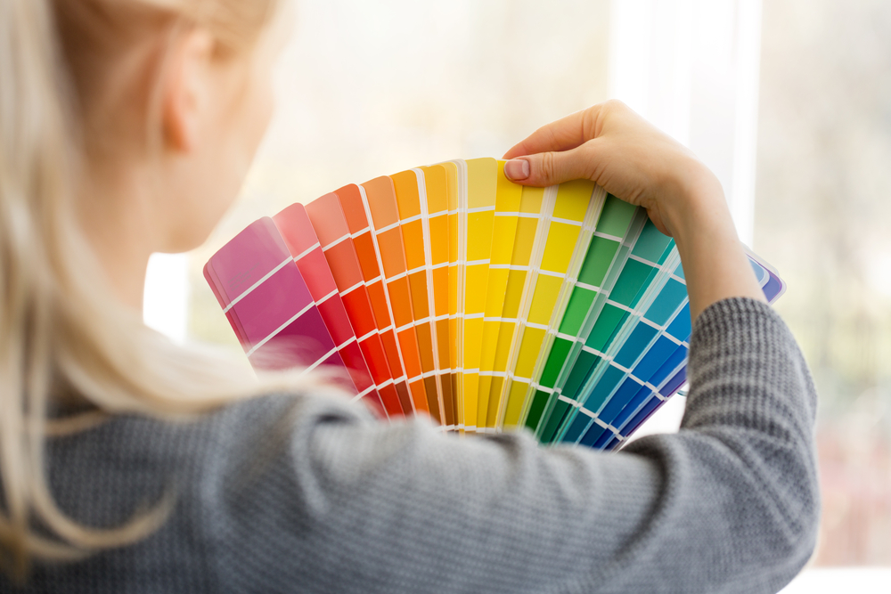
With 2,900 average monthly searches for ‘colour palette’1, many seek inspiration to understand the impact colour can make.
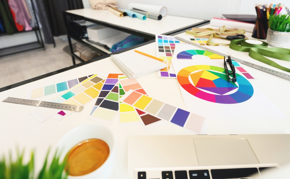
At its core, colour theory involves the strategic use of the colour wheel, colour harmonies, and psychological associations to encourage specific emotions and atmospheres.
Decorating can be expensive and time-consuming, so it’s important to get it right first time. From the warmth of monochromatic tones to the bold contrasts of complementary hues, people must balance elements such as saturation, temperature, and proportion to achieve a visually engaging space.
To help you understand how colour theories work, trends expert at Tapi Carpets & Floors, Johanna Constantinou, has shared her must-follow rules.
The colour wheel
Johanna employs a “colour wheel”, which “is used to understand relationships between different colours. It consists of primary colours (red, yellow, blue), secondary colours (green, orange, purple), and tertiary colours (such as red-orange or yellow-green).”
Complementary colours
“These colours are opposite each other on the wheel, they create high contrast and vibrancy, ideal for dynamic areas such as living rooms or creative spaces,” says Johanna.

Analogous colours
“These colours are next to each other on the wheel, they are harmonious and create serene, cohesive environments, ideal for bedrooms or relaxing areas,” explains Johanna.
Monochromatic
“These colours are variations of a single colour, using tints, tones, and shades, which create a soothing, minimalist aesthetic that works well in spaces that need to convey calmness and simplicity, like bathrooms or modern living rooms”, says Johanna.
60-30-10 colour rule
Another popular and reliable colour strategy is the 60-30-10 rule. You may have heard of it, but what exactly is it, and how can you put it into practice?
“60-30-10 is a timeless guideline in interior design that helps achieve a balanced colour scheme in any room. By allowing one colour to dominate, the design maintains cohesion. This versatile rule suggests dividing a room’s colour palette into three proportions: 60% for the dominant colour, 30% for the secondary colour, and 10% for the accent colour,” explains Johanna Constantinou, trends expert at Tapi Carpets & Floors.
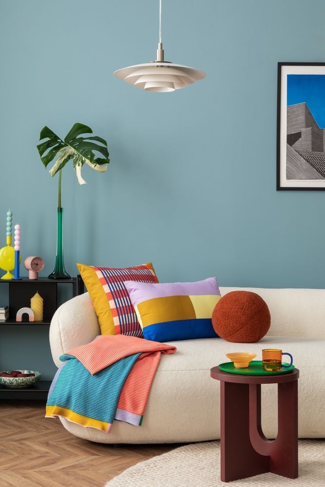
60% – the dominant colour
The dominant colour should cover the largest portion of the space—usually around 60%.
“This colour serves as the foundation of the room and sets the overall atmosphere. It’s often used on walls, large furniture pieces, or flooring. This colour should align with the overall mood and purpose of the room, whether it’s warm and welcoming or cool and serene,” says Johanna.
For example, a soft neutral like light beige or a pale grey on the walls and floors creates a calming backdrop, ensuring the room feels spacious.
“Coloured carpets are becoming increasingly popular. At Tapi, we offer a vibrant array of coloured carpets for those looking to make a bold style statement. A rich burgundy or plum carpet can help create a striking, colour-drenched effect in any room,” adds Johanna.
30% – the secondary colour
The secondary colour makes up about 30% of the space and adds depth and contrast to the dominant colour. “The secondary shade complements the dominant hue but is usually a bit more striking, offering variety without overwhelming the room. It’s often applied to larger pieces of furniture, window treatments, or accent walls,” says Johanna.
For example, a rich navy blue or a warm earthy tone, such as rust, could be used for the sofa or curtains, providing contrast to the soft neutral walls, while maintaining a balanced aesthetic.

“You might consider incorporating a rug for a similar effect, giving you the flexibility to refresh your decor more easily in the future,” concludes Johanna.
10% – the accent colour
The accent colour makes up the remaining 10% of the space and is used sparingly to add vibrancy, interest, and focal points. “The accent colour can be an unexpected pop of colour that draws attention to key features like artwork or throw pillows. Accent colours can be bold or vibrant, offering an opportunity to experiment with trendy hues without overpowering the room,” says Johanna.
For example, a vibrant mustard yellow or deep emerald green used in accessories, such as cushions, adds a touch of excitement and draws attention to specific areas of the room.
The Unexpected Red Theory is the latest trend in the interior design world, which suggests that adding a single red item can instantly elevate a space. Much like how red lipstick enhances an outfit, a touch of red in your interiors can add vibrancy and make the room feel complete. Consider using red as the ‘10%’ in your home, balancing more neutral or conventional colour schemes while giving the room an aura of confidence and individuality.
What is the best colour combination for 60-30-10?
“The best colour combination depends on personal preference and the effect you would like to create within your space, however, a classic and timeless combination is using a light beige for 60% of the room, a warm earthy tone such as rust or sage for the 30%, and an accent like emerald green to make up the 10% and create a brighter pop.

“While a predominantly warm palette can make a space feel inviting, adding cool tones provides contrast and depth. Similarly, a primarily cool-toned room can benefit from warm accents to avoid feeling too sterile or cold,” says Johanna.
Warm and cool colours
“The warm vs. cool colours rule is a key principle in colour theory, helping people to create spaces with specific moods and atmospheres,” says Johanna.
Mood and atmosphere
“Warm colours, such as red, orange, and yellow, create a sense of energy, comfort, and warmth, making them ideal for lively, social spaces,” says Johanna. “Conversely, cool colours, such as blue, green, and purple, induce a calming, soothing effect, perfect for where relaxation or focus is essential,” she explains.
Balancing warm and cool tones
“While a predominantly warm palette can make a space feel inviting, adding cool tones provides contrast and depth. Similarly, a primarily cool-toned room can benefit from warm accents to avoid feeling too sterile or cold,” says Johanna.
“Coloured carpets are becoming increasingly popular. At Tapi, we offer a vibrant array of coloured carpets for those ready to make a bold style choice. A deep burgundy or plum carpet can create a striking design feature. Alternatively, you might consider having a carpet turned into a custom rug for a similar effect, with the flexibility to refresh your decor more easily in the future,” concludes Johanna.
To find out more about colour theories, please visit https://www.tapi.co.uk/the-ideas-hub/style-inspiration/colour-drenching