Have you noticed that those furniture sets where everything is matching exactly have gone out of style? They’re still in furniture stores, but do you see them in homes or on Pinterest anymore? Not really. There’s something very dated about the concept. Instead, to look forward, everyone is mixing and matching the wooden furniture in their homes. Is it a matter of not being able to afford one massive furniture set in times of economic instability, is it that young people set trends and they’re taking what they can after college, or is it that it simply looks better to the eye to mismatch your furniture? We would argue that it’s primarily the latter. Mismatched furniture allows your eye to roam the room, catching things as they go, rather than giving it one blank canvas that it won’t take note of. But how do you do it right? Are there rules to mismatching wood without making the room look like chaos? Well, rules are meant to be broken, but we have some tips to help you get started.

Stick to an undertone
When combining multiple wood tones, it helps to choose finishes that have similar underlying hues. Stick to three complementary tones that have a related undertone. For a cohesive look, consider applying a coat of high quality wood oil to enhance the richness and depth of each tone.
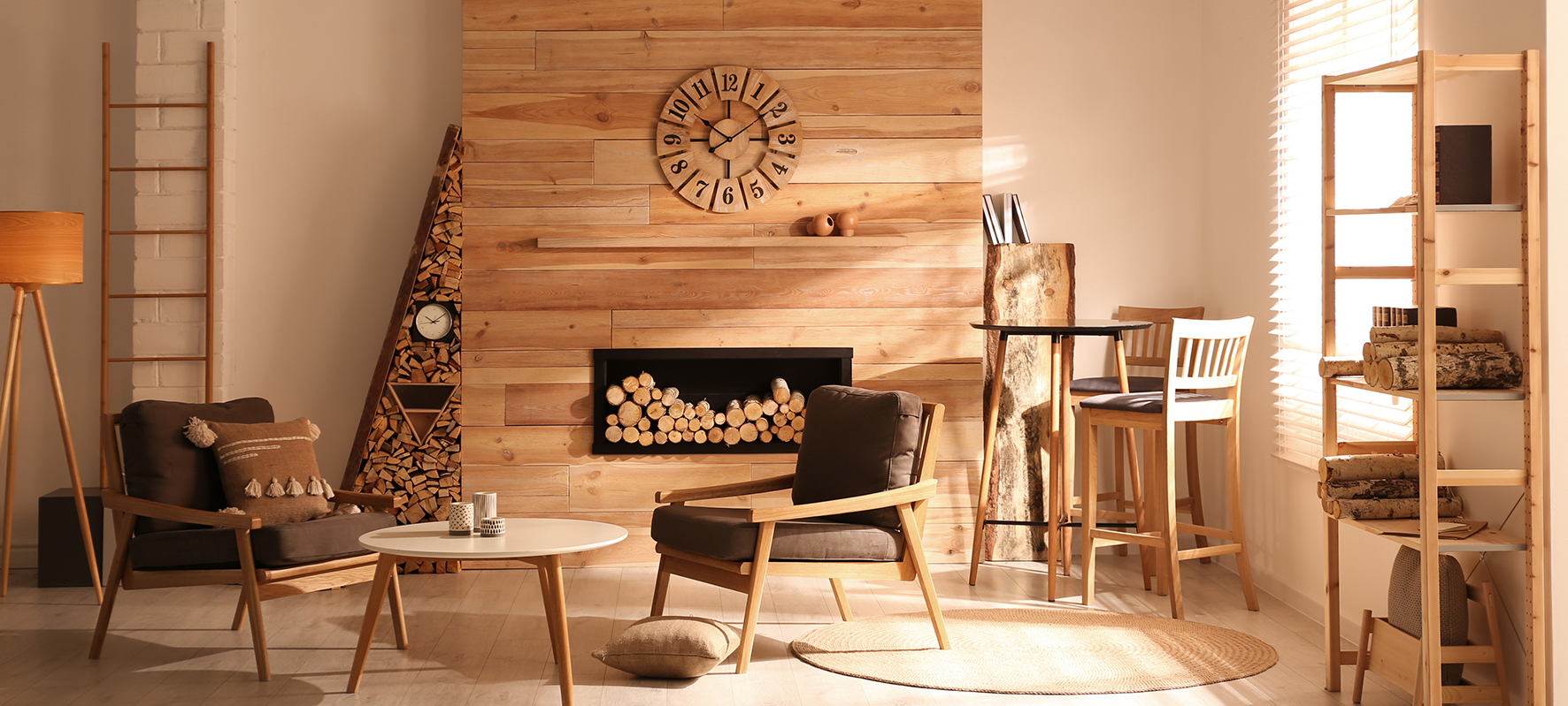
For oak, for example, go with lighter oak, darker walnut, and medium cherry. Too many competing tones appear mismatched.
Walnut, cherry, and oak work well together because they share common undertones of red and brown. Even though the stain colours may differ from light to dark, an intermingling of reddish-brown woods avoids a disjointed or messy look. You can have a walnut door next to a cherry cabinet without the room looking too chaotic. Find different wood variants of modern internal doors to match with lots of other variants on this website.
Make sure you look at your wood choices under natural light, as this is best for determining the undertone of the wood. Factor in oxidation and aging. As woods like teak or yew weather, richer, earthier browns emerge while woods like fir or poplar tend to mellow towards neutral beiges over time. Talk to your furniture salesman to know exactly what you are buying and what it might look like in the future.
Make bold contrasts
We say that, but there’s room to make a bold clash if you’re looking to make a statement. While similar undertones should dominate, strongly contrasting wood finishes can complement each other when used judiciously. Limit high contrast pairings to singular statement pieces. For example, use a reclaimed weathered oak dining table to add visual weight and rustic patina against light and airy, white-washed oak flooring or bring in an ebony coffee table to ground a soft blush pink linen sofa.
Use the 60-30-10 rule
Much like the 60-30-10 rule can be applied to colours in the home, you can apply it to colours of wood. You’ll want to establish a dominant tone as too much of a single tone can be monotonous but starting with one dominant tone can establish flow. Walnut and oak are popular base wood tones and you can go bolder for your secondary and accent tones. Have the dominant tone make up 60% of the wood elements, secondary 30%, and accent 10%. Limit accent woods to details like picture frames and decorative pieces or a singular statement furniture piece.
Think about your finish metals
And then there is the accessorising of your furniture. Finish metals and fabrics should coordinate with wood tones. For example, brushed bronze fixtures, dark hardware, leather, and wool will accentuate darker woods, whereas oiled bronze, nickel, cotton, and linen will balance lighter wood tones.