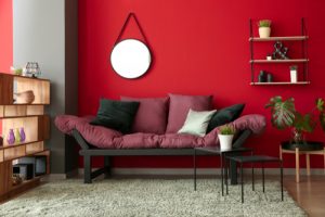
Red is arguably one of the most contentious colours in interior design, frequently topping the charts as one of the worst colours to paint a room.
According to several studies, red is thought to be one of the most stressful colours since it stimulates alertness and can even increase heart rates – not ideal for creating a relaxing environment.
However, red is becoming a popular choice once again with some of the biggest paint brands announcing red variations as their colour of the year for 2023, including Pantone, Benjamin Moore, Dunn-Edwards and Sherwin-Williams.
When used correctly, red is a powerful colour that can make a dramatic impact on interior design. Follow my top tips below to find out how…
Lighting matters
Before committing to a red-painted room, you should know how your home’s lighting will affect the way the colour shows.
For example, those with north-facing rooms that don’t get lots of direct natural light will have the red tones lean cooler or duller. Whereas those with plenty of bright light could see reds appear bolder than expected.
As with any bold colour change, test how a patch of your wall to see how the colour looks in different lighting conditions to assess whether it truly suits your home and avoid a costly mistake.
Consider a softer shade
 As with any colour, there are variations in shade and tonality that can completely alter the effect a colour has, changing the mood of your space.
While primary red may be too garish or even childlike for some tastes, opting for a paler, softer variation of red can be more visually appealing. Lean into earthier, brown-toned reds such as terracotta, or dull red’s boldness with muted clay undertones.
Alternatively, go for darker shades with hints of purple such as burgundy or eggplant to make a room feel enclosed and cosy.
Use red sparingly
 With red, a little goes a long way. Red is a powerful colour that can easily overwhelm a space if used too liberally.
Unless you’re someone that loves the wow factor of an entirely red-layered room, introducing red as an accent colour can avoid creating an overly stimulating and intense environment.
Most importantly, don’t neglect the small details. Even red-painted knobs, as seen in Kendall Jenner’s fabulous green and red kitchen, can make all the difference to a red theme without crossing over into gaudy.
The trick is to add small pops of red subtly and consistently throughout your space for a cohesive feel. Patterned pillows, candles, flowers and small trinkets can help tie in red tones into a room.
Introduce red in print
Unless you have plenty of natural lighting and a large room to fill, solid red walls and boldly coloured furniture will inevitably make a room feel flat or claustrophobic.
This is where integrating patterns and a variety of textures can make a space feel less flat and take away from the overwhelming nature of red. A patterned red sofa, printed curtains or rug, for example, will allow red to make a statement without dominating the room.
Just be careful when designing with prints to not go too matchy-matchy, nor should you introduce too many patterns.
Pattern clashing is a tricky skill many expert designers still struggle with. But if you want to give it a go yourself, my top tip is to make sure the prints you’re mixing share a link in some way. This can be either sharing the style of pattern or colour palette, but never both. You need to create enough contrast to make the prints stand out from each other while ensuring they are connected enough to be cohesive.
By Anne Haimes, Design Director and Founder of Anne Haimes Interiors
Ditch the dry shampoo this summer