Welcome to colour theory. If you’re not sure what it is or how to use it, allow this article to help you understand and pair colours in your home.
The theory is based on the assumption that we are all naturally drawn to certain colours. Whether you have a soft spot for citrusy hues, calming greys, or all shades bright and beautiful, there is an art in incorporating the shades you want in your home.
First things first, the colour wheel
Colour theory starts with the colour wheel which is guided by a set of rules. These rules dictate which colours go well together and how best to pair them for the most appealing aesthetic. It helps with colour harmonisation and shows how colours can evoke certain moods and create the right ambience.
The wheel is comprised of primary, secondary, and tertiary colours which can then be categorised into colour schemes. These include monochromatic, analogous, triadic, complementary, tetradic, and split contemporary. These, in turn, have different temperatures, moods, and associations.
Experimenting with colour temperature
Colour temperature can determine the atmosphere in a room. Reds, oranges, and yellows are often considered to be warm colours whilst whites, blues and greens are cool colours.
Depending on how you want to feel in a particular room, use cool colours to bring a sense of calm and relaxation and warm colours to inspire productivity and liveliness. For instance, you might want to paint your living room an autumnal green whilst your study might benefit from a rich red or yellow.
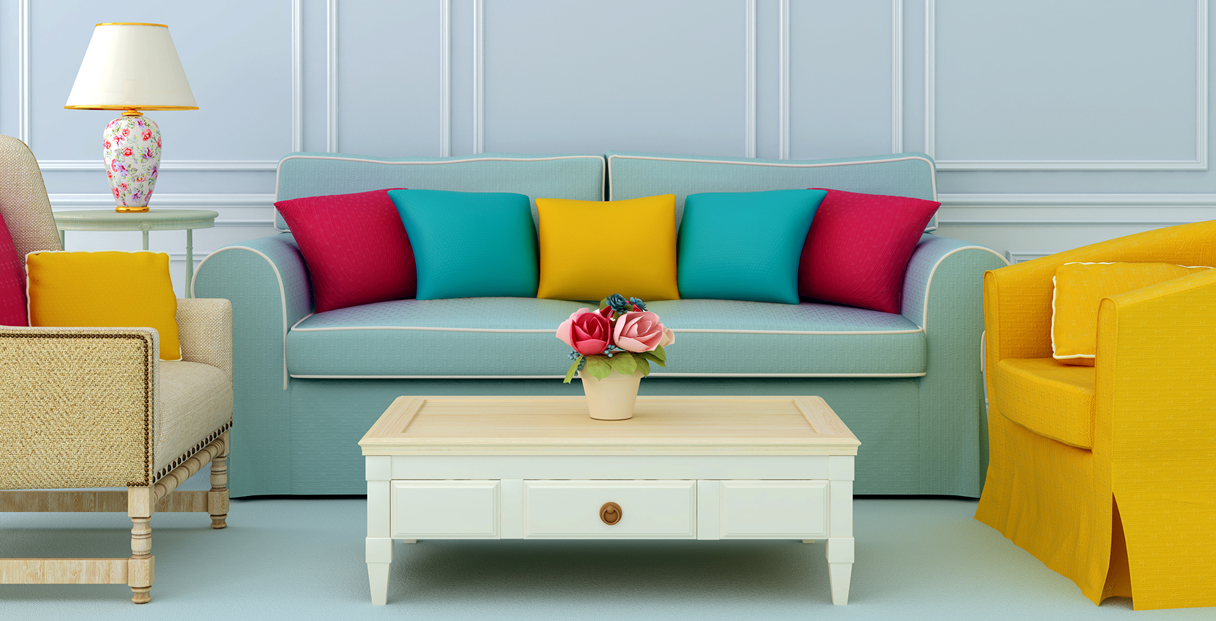
Mixing neutrals and bold colours
Don’t be afraid to mix different colour schemes and temperatures in the same room. If it’s a particularly large room that you’re painting, you can create different levels by mixing neutrals and bold colours.
Start with a neutral shade as your base colour, choosing perhaps a light grey, earthy beige, or cooling blue. From there, add pops of colour with playful cushions, warm fabrics, and floral patterns to avoid your room feeling uninviting or stark. Then, add on some texture with some wall panelling. texture-rich furniture like wicker or a collection of fuzzy blankets and throws.
The 60-30-10 rule
If you’re unsure about how to balance the shades in your room, the 60-30-10 rule is easily applicable in any living space. It divides the room into 60% for the dominant colour, 30% for the upholstery, and 10% for accent colours.
Have fun with your upholstery, adding bursts of colour with high-quality lampshades and furniture accessories. As for the leftover 10%, why not make it your favourite colour and let your personality shine?
Seaweed is Superfood For Your Skin